Design trends come and design trends go. Some we will never see again, but there are also those that last. With another year almost upon us, it's time to take a look at which design trends have been strong in 2025. And what would be more fitting than to delve a little deeper into these trends?
Why should you care about design trends? Which old favorites have become standard today and which ones just remained a trend? When is it really time to jump on a bubbler and when is it best to stay away? We explore all that and more in this article.
What exactly is a design trend?
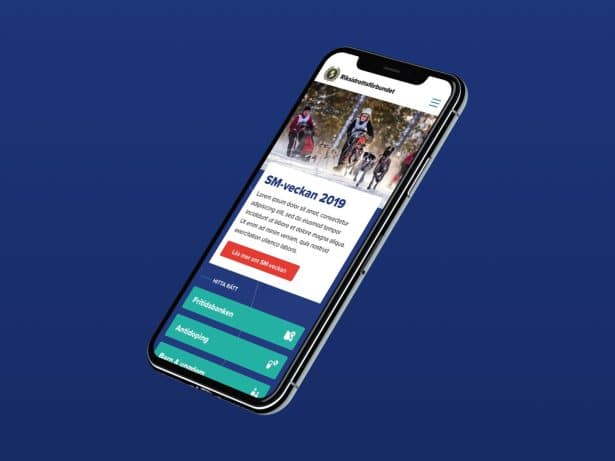
Dark mode. Brutalism. Neumorphism. Pastels. Glass effects. New design trends emerge every year. Sometimes they are just aesthetic whims, but rarely do trends emerge out of thin air. They almost always reflect something bigger: technological developments, changing user behavior, or cultural shifts.
Some trends become short-lived fads, while others stay and grow into what we today see as self-evident standards – simply because they actually make the experience better.
Why should you care about design trends?
Chasing trends is never the goal. But there’s a point in keeping track of them to pick up on what actually benefits your project or brand. What’s super hot today may feel outdated tomorrow – and the last thing you want is for visitors to leave your site because it feels dated or violates modern web standards. By incorporating trends that actually enhance the experience, you can keep your site competitive.
Design trends 2025
Which design trends have really shone brightest in this year's sky? There are, of course, quite a few. AI has continued to leave a clear mark, but there is more to be found in the trend candy bag. Here are five of the many design trends that we have seen a lot of this year:
- Bold and expressive fonts
If you're going to geek out a bit about typography, bold and expressive fonts have definitely been in fashion this year. Serifs have made a comeback, words have taken up more space than they've had in a long time, and maximalist typography has become a clear part of a brand's personality. - Animated scrolling experiences
When it comes to web experiences, we’ve really been scrolling our way through them this year. Scrolling has evolved into a tool for creating depth, narrative, and visual tension throughout the web. Content is revealed incrementally, graphics are unfolded, and we’ve seen a lot of progressive blur – where elements go from blurry to razor-sharp – as the user moves. - Experimental navigation
Experimental navigation has been popping up on more and more websites. It involves replacing the classic menu with unexpected interactions, 3D transitions, and playful layouts. - AI-generated images
It's hard to make a top list without mentioning AI. Of course, this isn't the first year we've seen AI-generated images, but with record-breaking developments in technology and accessibility, the use of AI-generated images and illustrations has certainly exploded this year. - Chatbots that feel like friends
Speaking of AI, there has also been a proliferation of cleverly designed chatbots this year. The functionality itself is not new, but the development is happening so quickly that bots now feel more like helpful friends that can provide personalized recommendations, guide users in real time, and relieve customer service.
Old trends that have stuck
Which trends from the past year will live on remains to be seen. For it is true that some trends actually make things better and therefore develop into pure standards. There are many such old favorites that came, saw and conquered in a certain year. Such as:
- Responsive design
Once a novelty, now it's a given. When mobile took over, responsive design became a must. It started as a trend but is now fundamental to all web design. Very few users will accept a site that doesn't work on all screens. - Minimalism & whitespace
Minimalism has long been a design philosophy. One of the world's most influential product designers, Dieter Rams, expressed it back in the 1970s in his principles for good design: "Good design is as little design as possible." When Apple then switched to flat design, it gave minimalism a modern boost, even digitally. Today, clean surfaces, few distractions, and air between elements are not just a style trend – but a standard for making interfaces easier to navigate and use. - Sticky navigation
Sticky menus are one of the things that have been tried and tested throughout history to improve the user experience. Today, it is one of the most obvious navigation patterns. The user does not have to scroll up and down to find their way back, which provides a smoother experience.
Old trends that have faded
For every trend that sticks around, there are quite a few that just stay trends. These are things that feel exciting for a short while – until they become impractical, annoying or just too much. Some examples of these are:
- Duotone
Duotone had its big boom a few years ago and was widely used to create dramatic, colorful visual identities. But like many color-intensive trends, it lost momentum when the expression started to feel overused and sometimes a little too dominant. - Neumorphism
A hyped trend when it arrived, but quickly criticized for poor contrast and lack of accessibility. Stylish in theory, less smart in practice. - Never-ending loading animations
Sure, they were charming – for five seconds. Then they became mostly an annoyance. Now speed is prioritized over “charging show.”
When is it worth jumping on a design trend?
There are times when it's actually both smart and business-savvy to jump on a new trend. As long as it's not at the expense of usability or your brand, it can definitely be worth giving the trend an honest try. Here are three situations where it often pays off:
- When it improves the user experience
Trends that make it easier for the user to understand what’s happening on the page are almost always worth exploring. Microinteractions are a good example – small, subtle animations that indicate that something is clickable or confirm that an action has been completed. They make the interface more intuitive and help the user along the way, rather than just looking cool. - When it strengthens the brand
Some brands are expected to be at the forefront. If you are a tech company, a design agency or a trendy consumer brand, a contemporary, trend-conscious design can signal that you are relevant. But this requires a sense of tact – the right trend can elevate the brand, the wrong trend can feel like a suit that doesn't quite fit. - When the trend is becoming the new standard
Some trends start out as niche but quickly become part of user expectations. Dark mode is a prime example: from being a “nice to have” feature, it’s now something many are actively looking for, especially in apps and SaaS environments. It may seem obvious, but when a trend moves from hype to expectation, it’s time to jump on board.
When should you stop jumping on a design trend?
Trends often emerge that feel sassy in the moment or simply too fun to ignore. It can feel very tempting to try. Some may even feel pressured to do so. And sometimes that can be great. But just as often, trend-chasing can be expensive, impractical, and downright detrimental to the user experience. Here are some red flags to keep in mind:
- When it comes to conversion or availability
Light text on a light background, low contrast, or buttons that are hard to find can be seen
looks nice in theory. But in reality it can ruin the user experience. Design
It can be trendy, but it must always be clear and accessible. - When it gets messy to maintain
Some trend-driven solutions are often visually impressive but practically hopeless. You
maybe you'll get a nice looking website, but as soon as the smallest heading needs to be updated, help is needed
from a designer. It becomes expensive, time-consuming and difficult for everyone involved to manage. - When it doesn't suit the target audience – at all
A trendy aesthetic can be fun, but it has to match the context. A site for
a government agency or a B2B company in finance may not feel like a
AI startup in San Francisco. If the trend clashes with the target audience's trust or
expectations, the result is most confusing.
Trendy or timeless? Questions to ask before you jump in.
Before jumping on a trend, it might be wise to do a quick check. These questions will help you decide if the trend actually suits you or just looks good in theory:
- What do we want the user to do? Does the design help with that?
- How does this affect conversion, accessibility, and content management?
- Will the solution still feel right in six months?
- Does the trend fit our brand or are we trying to be something we are not?
- Do we know how to measure whether this actually works?
This is how we think about Mild
We love to try new things. But we always do it with the user and the business in focus. When we design a website, we don't do it for the sake of it, but to strengthen the brand, simplify it for the user and create actual business value. If a trend can help us get there – then we're happy to jump on it. But never at the expense of function, accessibility or manageability.
Are you keen to learn about design trends? Do you need a second opinion on your current design? Or do you want to talk about what actually works for your brand? Get in touch and we'll talk further.